This has been touched on in the threads for the new supersix Evo and caad13, including by yours truly, but I can't hold back from giving this its own thread bc to me, it's a pretty nuanced and interesting topic of discussion and I can't stop thinking about it.
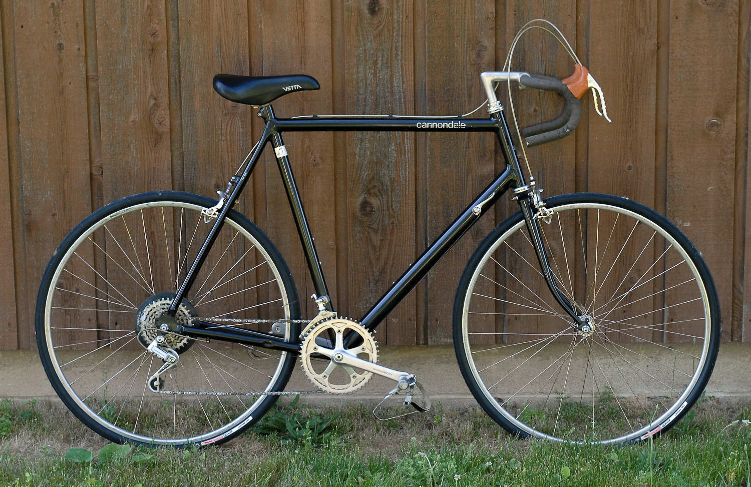
Cannondale is clearly ALL IN on this new paint scheme with tiny top tube logo, understated colors and some weird stripes, and want all their new mid and top end bikes to look this way. Since AXS was launched, the new builds of system six and synapse were put out with only this scheme, and then the new supersix, topstone carbon, and caad 13 entire ranges are exclusively in this scheme. They're also doing it on the MTB side with the new habit and bad habit.
These paint schemes are the ugliest on the market IMO. By far. And I love Cannondale as a brand. I ride a slice. I'm from southwestern CT, where their Wilton office and the namesake Cannondale village is. But the new bikes are so ugly that it's making me upset at this brand that I've respected and loved for years. Personal preference and style is all in the eyes of the beholder, and I get that. They want the bikes to stand out and have a unique style that people associate with the brand. Okay. But there's one aspect of this that confuses me to no end: the marketing.
EF team isn't riding this paint scheme, obviously because if on TV you couldn't even tell who made this bike. There is only one logo, it's relatively microscopic in size, and in a non-traditional location. Why would they make bikes with such little self-promotion? How did a marketing person not go berserk and squash this idea when it was being developed? On some bikes, you literally can't see the logo unless you zoom in and look for it.
Maybe I should have posted in the cry like a biatch thread about how much I dislike the schemes and now can't buy a Cannondale because I wouldn't be caught dead riding a bike that looked like the new ones do. But, I want to hear others' opinions of the paint and what the thought process is behind a brand going all in on something like this. The paint scheme and look of a bike is really important for the consumer but also the brand from a marketing and appearance perspective, and I feel this is a pretty huge gamble they're taking.