Sure, and that’s why there is a widget in the UI that allows you to rapidly jump to any point in the thread’s history.
On desktop it looks like below. You drag it up or down and it tells you the post # and date you will jump to. That is strictly more useful than the old mode of picking a “page” which spans 25 posts from a date range that’s impossible to know ahead of time.
On mobile you tap this thing and it brings up more or less the same thread scroll UI.
The thread should be retitled “Disruption Annoys Me.” This is not about change. It is about annoying disruptions and degradations of many micro-features that were important to a lot of people.
The old forum platform had to go. There are many solid platforms in the wild, but none is perfect. This was the selection.
I do miss the little icons on each thread in the old forum. I don’t think I fully understood what each meant, but it was always neat if my thread got some traction and turned to the “fire” icon.
“The thread should be retitled “Disruption Annoys Me.” This is not about change.”
TBH I’m amused that this thread has gone on as long as it had; when I started it there were several others already that were critical of the new design. I figured this title was at least self-deprecating, with, in my mind at least, a shout-out to Abe Simpson.
Not really solving the issue. The infinite scroll bar is confined to a finite space. So as the threads become bigger and bigger then the scroll bar becomes less and less accurate. Minute movements can cause big jumps in posts. Also the feature is completely different on the iphone interface. I have to keep my thumb on it to scroll. If I take my thumb off then it automatically loads my page to whatever post it is corresponding with. That is “ok” on the laptop screen as there is more screen and content.
Not only that but, again, for memory purposes if I’m blocking off thread content by page it is a lot simpler to say “ok I’ve read all of page X now I know where I can pick up next.” Instead I have to open a thread and rescroll to find my place. Which also is difficult with larger threads that require pages because the scroll feature becomes less accurate. Ultimately it will take more time and clicks/scrolling/hoping you don’t pass it to get back to reading a lot of content.
Or just click the bookmark tag on the last post you read so you can go straight back to that post anytime later. Just pointing that out again in case it was missed.
Then I’m just flagging tons of different posts and that’s not any better.
For example: any shooting thread or climate thread or “other forum” thread etc where a lot of posters contribute, I may want to jump back and forth to re-read tangents or arguments as news posts are made. I do this frequently in threads if interest to me.
I’m pretty good at remembering what pages or areas of the thread I had to go to.
An infinite and very fickle scroll for threads that have hundreds of posts is just an inefficient PITA to me. Especially the way the content is displayed on the screen (even with the smallest font).
Not replying to anything in general, just a question. Are all old threads permanently gone? That would really suck, there’s a lot of great info stored here. Anything I find via Google now says it no longer exists. Sorry if this has been covered.
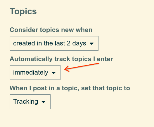
The site keeps track of where you left off, and it drops you back exactly in that spot. When re-visiting a thread you’ve already read, but there are new posts, the site should insert you in at exactly the point you left off, with a clear marker. No scrolling needed at all.
It works (for me) much better than the old forum, which would insert me into random pages of any thread I viewed. If you are logged in and it’s not keeping track of where you left off, then you might want to tweak your setting for “tracking” threads, so that it happens immediately for every thread you view:
But if your argument is really “I don’t like tools for easily navigating threads, I prefer to memorize my place in every thread”, then there is no point in continuing this conversation. Good luck.
You can be as sarcastic and condescending as you’d like however that’s not what I’m saying at all.
It’s abundantly clear that the new platform easily denotes where and spawns you where you left off.
That’s not what I’m talking about at all.
I’m talking about a break in content for navigating back and forth OTHER than an infinite scroll for threads with 10 or 1000 posts. Today nothing of how the infinite scroll acts on a mobile device.
There are many different reasons for wanting to jump back and forth in a thread and having page breaks is easier to navigate that than an infinite scroll in a finite physical length.
Tagging @SlowtwitchSupport – not sure if they put in the 301s to redirect from forum threads (and the 97 various permutations of every URL that got created in Gossamer, which is one of the other problems we had).
I have found google searches generally always bring me to broken links to thread titles, but then I copy and paste that thread title into the new ST search function and voila, it always finds it!!!
As for old site functionality, versus new site functionality, maybe this is like knowing how to drive and then taking a flight from LA to Sydney…now how you interact with the road is different but it is till driving. At least this is not like flying from LA to Tokyo and driving on the wrong side of the road AND everything is in Japanese.
It’s all still driving on a forum road. Different framework. I’m getting used to the new style of driving around here and it seems easy enough.
Yes. Click on the username. Next, click on “More…” and then you can change the user’s status from Normal to Ignored by using the drop down list in the top right corner.
One more user experience observation to think about…
It feels like this platform is optimized for one-way consumption by shorter-term participants, rather than dynamic community interaction between long-term members. I have used this platform most often in LeaseHACKR - a forum that is more like a bulletin board with a few contributors posting information to passing readers.
Forums optimized for community engagement have a couple little nuances that encourage interaction. Every other community-oriented forum I have used has a clear presentation of each thread’s original poster and the most recent poster. This kinda does it, but only through the small bubble icons. We need user IDs, because this is a community and folks want to see who posted an folks tend to have more affinity with other users than a one-way type forum.
i don’t understand this comment. i don’t dispute it, i just don’t understand your technical argument. when you write, “clear presentation of each thread’s original poster and the most recent poster” and that this current forum does it through icons, i see the person to whom you replied (rrheisler in this case) both via the icon and the user name. right in your post. i don’t have to hover over a bubble. as to the original post in the thread, i don’t believe our old forum had that (you had to just go to the first post of the thread to see who started it). so i guess i need more help from you on how this forum is designed to appeal to drive-by users rather than those in the family.
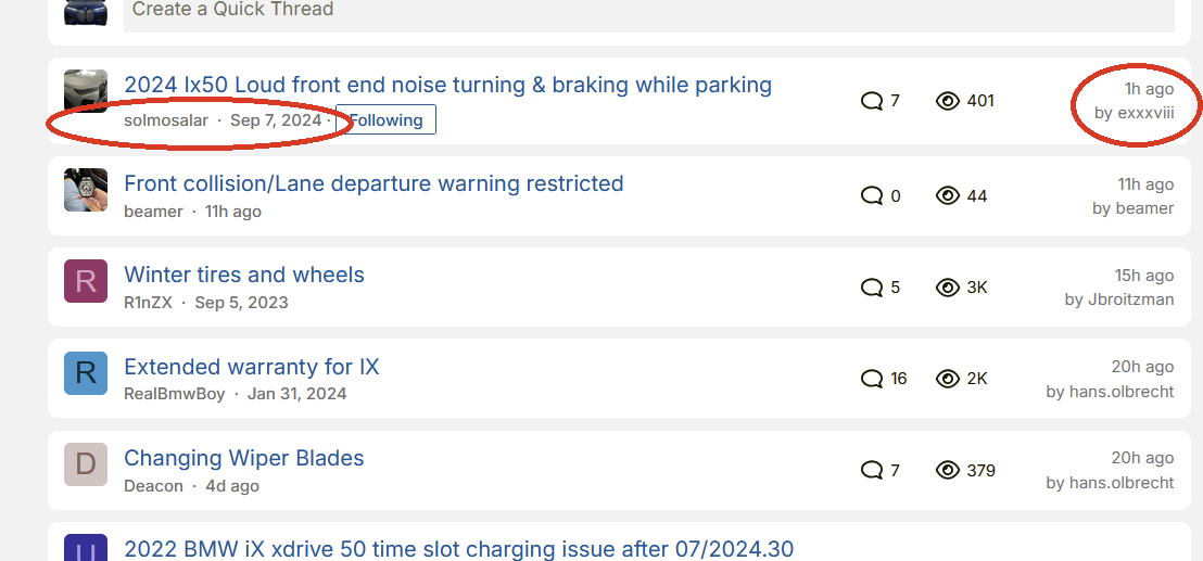
Here’s a screen clip from another forum I use. Literally every other platform I use does this. It is a nuance, but I realized that it is very helpful in looking at threads I want to jump into.
In a brief glance, I know how old the thread is, who started it, who responded most recently, and when.