It’s not a platform issue. It’s a template thing. It might “just” be CSS. Or it might require a plugin.
But whatever we do has to work across all platforms. The mobile version of the site has less of that space on it – and we need to make sure we don’t break that in order to create less space on desktop (as, well, a whole lot of our traffic and users come from mobile.)
Totally agree. I really don’t like the new format but am sure given time it will be ok.
One huge step backwards is the paging on the big threads. You knew exactly where you were up to and could go directly to the last page you read. Now you have to scroll through all the threads and tbh I can’t see me doing that on the mega threads.
This is so much better now. On the right side (desktop) or bottom right (mobile) there is a control that lets you rapidly scroll a thread’s entire history. And it shows the date as you move through history. SOOO much better than randomly hopping between pages.
And if you are logged in and ‘tracking’ a thread, the new forum actually does accurately keep track of where you are in a thread, and sends you directly there when you view. Old forum always sent me to a random spot every time I opened a thread.
It’s just CSS. Should be relatively easy to tune, though I’m not familiar with the level of templating Discourse offers.
The padding for .topic-list .topic-list-data is 12px currently, which is indeed pretty chunky. Removing that padding densifies things nicely, and seems to look decent across form factors. Hopefully these are the things you can tinker with in a template.
The criticism of the new site really seems like… ridiculous to me. Maybe not if you consider our natural resistance to change, but definitely if you look at the pros and cons.
Example. A minute ago I posted a link. How did I achieve this grand milestone? Just copied and pasted the fecking thing into the content of my post, and not only did the link show up as active, but a box containing a preview of the linked article was automatically added to the post.
Compare that with the hoops you had to jump through in the previous site:
Copy link. Paste link. Highlight pasted text. Click on a tiny icon (from this stage on things become difficult on mobile). Select the redundant default “https://” in the URL box so that it’s replaced by the link and not left in front of it (else the link will be broken). Paste the link. Click on “OK”.
It’s not really that ridiculous. Mods even admitted some things are easier and some things are harder. If you’re a frequent poster who doesn’t need or use a lot of the functionality that is easier then it’s going to be natural to object to the changes.
Yes we will all adapt or move on as those are the only two options. But to suggest it’s ridiculous for long time posters to have objections to a major site overhaul that includes functionality changes and some things more complicated is not really fair.
People will like some things and dislike others. As is the way.
Fair point… sort of. I mean, we just see people complaining about a gazillion things here just because they need to change their habits, not because these things are less user-friendly than they were in the old forums. There is this massive exaggeration, dare I say whining.
It should not be problematic – another nice benefit of a modern forum framework is that thread content is not loaded in bulk. When you open a long thread, only a small batch of posts is actually downloaded initially (20 posts, based on a quick peek at network activity). More batches are fetched dynamically only if/when you scroll down.
Was noticing from google… It looks like urls changed from old to new provider… Ie searches that might have pulled up a particular post now dead end… Probably not awesome for your seo(and… Id be lying if i didn’t say i occasionally get back to something from google)
If you can find a way to add some 301 redirects it will probably help you
I feel as if everyone saying this is making an assumption that things will only be read through once and any time you open the thread you automatically only want to be directed to the most recent unread post.
If i want to read-read certain info in a thread with hundreds of posts I would think almost everyone would agree some way to catalog or separate them is ideal.
The infinite scroll bar (in a fixed space btw) is going to prove difficult to manage in those kinds of threads.
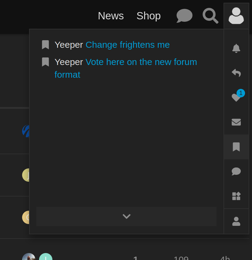
The bookmark feature is useful. Every post has bookmark icon. Click on it, then it shows up in your personal bookmark thing which you can get to by clicking on ur avatar in the upper right. I bookmarked two of ur things in my screenshot. Click on each one, and it takes you right to that post.