Thanks for posting the report. The authors deserve a lot of credit – it’s a polished, well-articulated write-up, clearly very high-effort, clearly a lot of time went into it. Especially big props for sharing their data set.
That being said, the report is quite simply not interpreting the data correctly. And I think others here are making the same mistake.
Groundwork
The core argument of the report is that a gender-blind proportional slot allocation system unfairly disadvantages women, because the women’s field follows a fundamentally different distribution of abilities compared to men. It asserts that the women’s field “punches above its weight” so to speak, with proportionally more finishers coming in close to the AG winner’s time, as compared to the men’s field, indicating that “top” female performers are overrepresented compared to their male counterparts. So we need to invite disproportionally more women to WC to get equal representation of talent.
The basic facts all check out. Indeed, the data show that across every race, every region, proportionally more women finish within 15% of their AG winner than is the case for men. There are some nice pull quotes like “On average 30% of women finished within 15% of the winning time in their Age Group, compared to just 14% of men.”, “a woman who starts an IRONMAN is more than twice as likely as a man to finish within 15% of the winning time in her AG”. These statements are factually correct.
Here’s the key chart from the report:
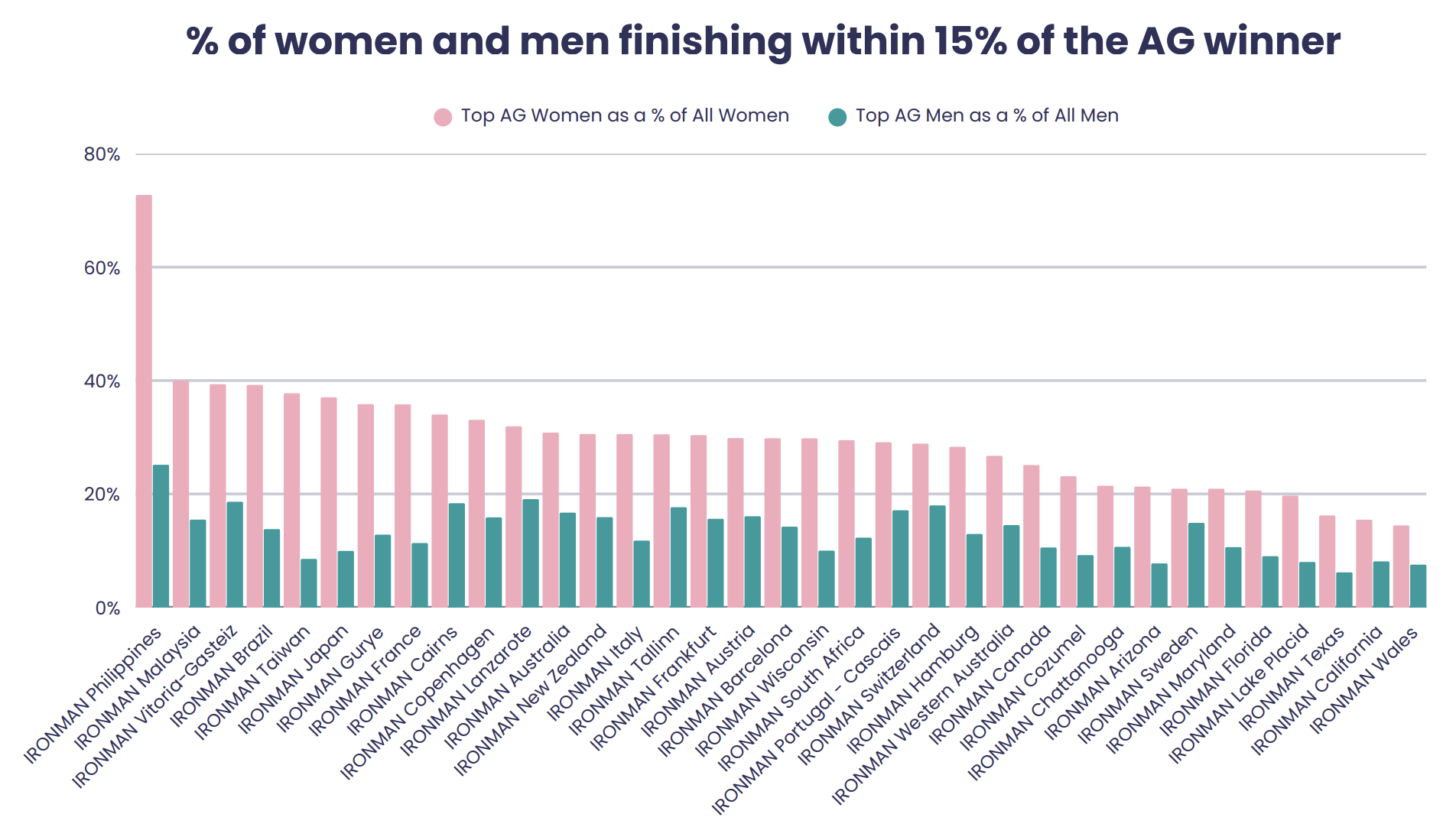
Wow, looks pretty convincing! The women are really stomping the men!
Invalid conclusion
The report takes the above facts at face value, and concludes that women must have a different, “top-heavy” distribution of talent compared to men. Pull quote: “Women outperform their numbers”.
This conclusion is not mathematically sound, and is not supported by the data.
That proportionally more women than men finish within 15% of their AG winner is a statistical inevitability given their smaller AGs, not evidence that their performances follow a different distribution. We would see exactly the same phenomenon if the talent distributions were identical.
i.e. if we took 200 30 year old men, randomly assigned 40 to “Group A” and 160 to “Group B”, and had them all race, on average we would see that proportionally more Group A athletes finished within 15% of the Group A winner’s time, than Group B athletes finishing within 15% of the Group B winner’s time. The effect is more pronounced the more lopsided the group sizes become.
It’s not an indication that talent is distributed differently in members of Group A vs Group B, it’s just how the math of small vs large sample sizes works out. This is borne out with computer simulations, feel free to write one and verify it yourself (I’ve shared mine below).
Comparison based on AG size
Ok, so I’m claiming this is just a side effect of smaller AGs, not a women vs men thing. If that’s the case, then if we normalize by AG size, the disparity should disappear, right? Thankfully, because the authors shared their data, we can try this.
Here’s what the chart looks like when you compare men and women in similar AG sizes:
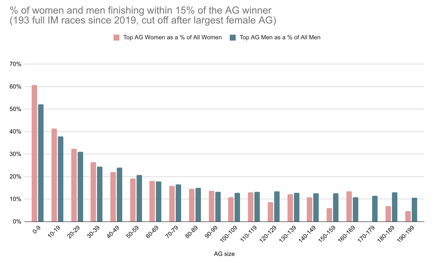
Suddenly it doesn’t seem so obvious that there is some fundamental difference in how women and men race. The bulk of the movement here comes as a consequence of AG size. The male/female disparity is reduced to noise. (Note that the extremes of this chart are less reliable than the middle, due to fewer races with these AG sizes.)
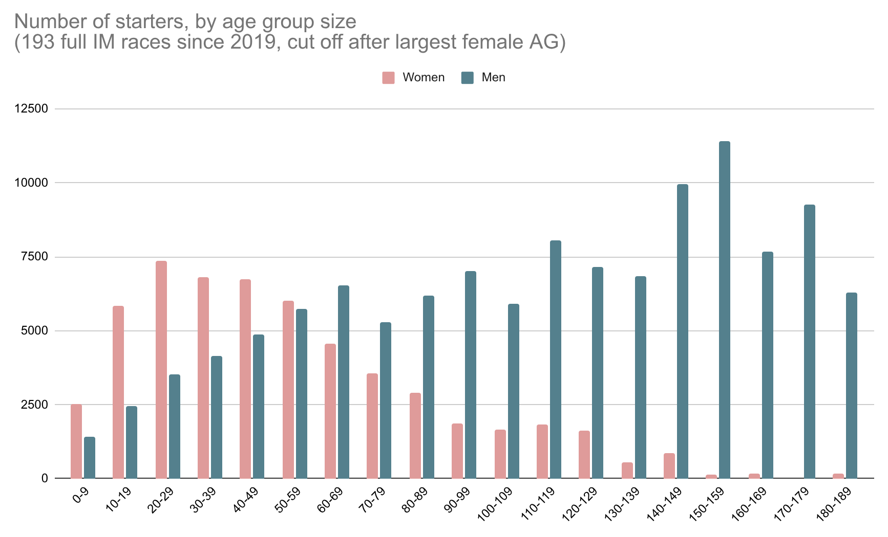
If you look at total starters per AG size, men and women achieve roughly equal numbers in AGs of size 50-60, so that seems like as close as we can get to apples-to-apples. As many men as women raced in an AG of size 50-60 since 2019.
My charts above are based on the full data set published by the report authors, which includes 193 races back to 2019. For completeness, here is a version of the chart that considers only the 35 “recent” races that the report focuses on:
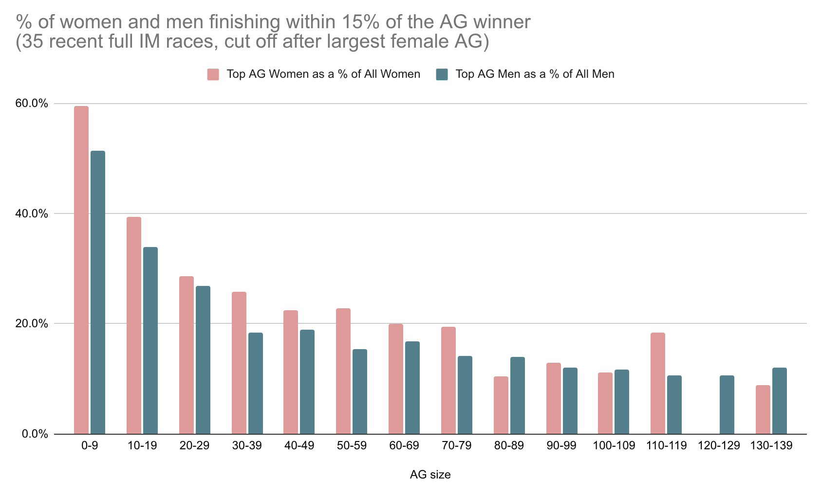
The women do make a marginally better showing in this sample. That might be statistical noise (this data set is less than 1/5th the size), or maybe an interesting indication. Keep in mind that the women looking “ahead” in the recent sample, but “equal” in the full sample implies they are “behind” in samples from earlier timeframes. Which would somewhat undermine the report’s stated rationale for a different women’s distribution – that it’s the early adopter women who are disproportionally powerhouse athletes.
Either way, this is the way people should be looking at the data – apples to apples normalized by AG size – not apples to oranges comparing same-race AGs of vastly different sizes.
Conclusion
Proportional, discrete slot allocation isn’t perfect, there are unquestionably quirks and bad outcomes. But so far nobody has shown any evidence that these quirks systematically affect one gender more than the other. The biases and quirks that this report focuses on apply equally to men and women once you normalize for AG size.
Appendix
- The report relies on Coach Cox data. Coach Cox is a super useful site, but its dataset is flawed in at least one way I’m aware of. It does not capture AGs with 100% DNF rate, i.e. there were starters, but none finished. This will skew the data for small AGs to make their % of “top finishers” artificially high. 1 finisher of 1 is counted as 100% top finishers, but 0 out of 1 is just not counted at all? These should really be counted as 0% top finishers.
- There are a ton of other interesting things to dive into which are probably beyond my ability. Let’s say the AG sizes are equal. The natural differences in male/female abilities are now all that matters. How does the 17h cutoff play into this?
- By definition, everyone in an AG finishes between 1st place time and 17h. For women, this range is compressed, as 1st place will be slower (closer to 17h) than corresponding male AG. Additionally, a slower winning time means 15% represents a bigger absolute cushion of time. So for women we are offering a bigger cushion within a smaller range of finishing times? Seems unfair…
- One thing I think actually is systematically unfair for women is using the same 17h cutoff time as men. There are women DNFing who are putting in equivalent performances to 16:30 male finishers. Surely some of them are in 1-person AGs and would have earned a slot!
- The report conveniently fails to mention that all of the “women are disproportionally fast” metrics they present are mirrored on the slow end of the field. More women are within 15% of the slowest finisher in their AG than men, too. Not because women are disproportionally slow, but again simply due to how the math works out. (Note: I have not actually confirmed this, but I am pretty confident it’s true. There is also a chart posted earlier in this thread which shows this.) So even if you buy into their analysis, by their own logic, women are somehow both extra slow and extra fast. Which again undermines the rationale that “early adopters skew toward the fast end”.
- Here’s a simple simulation that illustrates the sampling phenomenon. Written in Mathematica (lol, sorry). We model every racer as equal, finishing according to a normal distribution with mean 12 and sd 1 (roughly IM finish time in hours). Race 200 athletes, split into group of 40 and 160. After 1000 trials, despite all athletes having precisely statistically equal abilities, we see the small group is on average “disproportionally fast.”
percentWithinCutoffOfWinner[n_, cutoffRatio_] := (
  finishTimes = RandomVariate[NormalDistribution[12, 1], n];
  winningTime = Min[finishTimes];
  Count[finishTimes, t_ /; t <= winningTime*cutoffRatio]/n
  )

N[Mean[Array[percentWithinCutoffOfWinner[40, 1.15] &, 1000]]]
// 0.270975 (small group is ~27% 'top performers' on average)

N[Mean[Array[percentWithinCutoffOfWinner[160, 1.15] &, 1000]]]
// 0.123325 (large group ~12% 'top performers' on average)