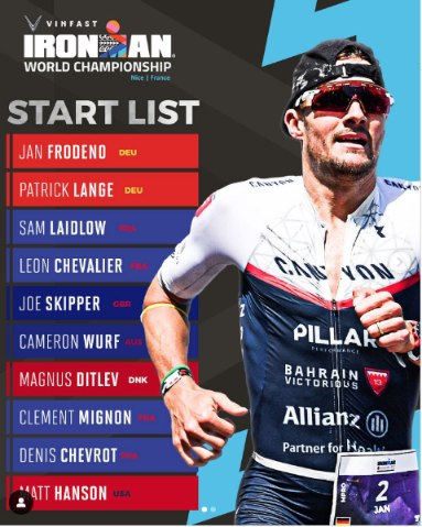
Can anyone explain the colour scheme for the start list below? Why are there different shades of red and then some random blues etc.?

Can anyone explain the colour scheme for the start list below? Why are there different shades of red and then some random blues etc.?
Seems like it is just a really poorly executed color scheme based on nationality.
I wondered about that but could see no rhyme or reason. Likely the Graphics people thought it looked nice.
Simpson, Matthews and True are regional champions (the other is Philipp but she’s already named): that’s why their names are in lights.
I looked at how they’d allocated numbers in previous years but this time it’s a bit different.
2022 podium in order, previous winner, 70.3 champ, then the 2022 results order.
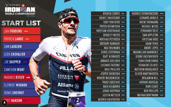
Has to be the strongest ever. I can see no current full distance athlete missing from this list. I appreciate it’s 16 days to go but I do hope they all make it to the line.
The SOF is headed for 94+ but it maybe less because the 2022 IMWC Kona results will/may wash out when the calculation is made and that will affect LCB’s and Sodaro’s points so drops to ~93.3.
I assume predominant country flag colors but leaving out black and white where possible because of the text and background colors - Norden is blue/yellow for Sweden, Ryf is red/white for Switzerland, US athletes red/blue, Great Britain and Australia have similar flag colors blue/red, German athletes are red/yellow.
It does look like a hot mess though…
**I wondered about that but could see no rhyme or reason. Likely the Graphics people thought it looked nice. **
Simpson, Matthews and True are regional champions (the other is Philipp but she’s already named): that’s why their names are in lights.
I looked at how they’d allocated numbers in previous years but this time it’s a bit different.
2022 podium in order, previous winner, 70.3 champ, then the 2022 results order.
Has to be the strongest ever. I can see no current full distance athlete missing from this list. I appreciate it’s 16 days to go but I do hope they all make it to the line.
The SOF is headed for 94+ but it maybe less because the 2022 IMWC Kona results will/may wash out when the calculation is made and that will affect LCB’s and Sodaro’s points so drops to ~93.3.
And once again, if you have to ask what a graphic means…likely isn’t a good graphic.
This is one of the reasons why the Ironman corp frustrates me so. They want to be looked at as a professional sporting group…well then ACT like a professional sporting group, which includes hiring/sourcing out the correct people for the job. Frustrates me to no end to see silly mistakes like this.
Wow. Picking at nits here.
Did you guys also hear about that guy Messick eating an apple once on a 60 minute phone call?
Wow. Picking at nits here.
Did you guys also hear about that guy Messick eating an apple once on a 60 minute phone call?
I get what you are saying, however, they want to be seen as a professional corporation. If you want that, the little things really count.
But you are probably correct, not sure why this one bugs me so much.
Or I can pile on and say it’s probably such a hot mess because the graphics team went on vacation after the “real” World Champion was already crowned and this is just for the “Women’s World Championship”… 🙄
“Who cares if you haven’t finished the color info bars,” Messick chortled at the graphics intern, “my fridge is out of apples, so get that post online right now and go buy some more from the store.”
Wow. Picking at nits here.
Did you guys also hear about that guy Messick eating an apple once on a 60 minute phone call?
What do you have against people eating apples while on the phone?
They did the exact same graphic style with the exact same color scheme for athlete nationalities for Nice. OP apparently wasn’t paying attention then.
Maybe the ‘Graphics Peeps’ reckoned that the Men’s IMWC post would have more impact if they used “different shades of red and then some random blues” and then thought that they’d better replicate that style to avoid being accused of discrimination and downplaying the (stronger btw) start list.
Maybe the ‘Graphics Peeps’ reckoned that the Men’s IMWC post would have more impact if they used “different shades of red and then some random blues” and then thought that they’d better replicate that style to avoid being accused of discrimination and downplaying the (stronger btw) start list.
On paper (or graphic) they look exactly strong to me - top of the game. But we know what happened to the men shortly before race: Max Neumann out, DB out, Salvisberg out etc. Fingers crossed only a few drop from the women field.
It’s funny, I saw the graphic as well and my very first thought was also “Wait, what do the colors on the left mean”? My second thought was assuming my comptuer was all confused and rendering things wrong.
My third thought was to close the tab. I haven’t thought about it again.
I also have no idea.
Though US and EU but no.
They did the exact same graphic style with the exact same color scheme for athlete nationalities for Nice. OP apparently wasn’t paying attention then.
Ok, so they were stupid twice?
It’s funny, I saw the graphic as well and my very first thought was also “Wait, what do the colors on the left mean”? My second thought was assuming my comptuer was all confused and rendering things wrong.
My third thought was to close the tab. I haven’t thought about it again.
I think my graphic design friends are rubbing off on me.
I think they should have made the country tie in more obvious, like people have for their names on their bikes…